Internal Linking for Ecommerce: The Ultimate Guide
April 11, 2023
Table of Contents
Internal linking is a crucial aspect of any website, but it is especially important for ecommerce websites.
Internal linking helps improve the navigation and user experience for your website visitors and can also help improve your website’s search engine optimization (SEO).
This article will discuss the best practices for internally linking pages on ecommerce websites. To help illustrate these opportunities, I’ll use some of my favorite examples of ecommerce SEO done well – the portfolio of Williams Sonoma brands. (Disclaimer: I have no affiliation and have never worked on any of these sites.)
But first, let’s lay the groundwork for why these tactics are so important.
What is internal linking?
Internal linking refers to linking one webpage to another on the same website domain. When a user clicks on an internal link, they will be taken to a different page on your website. These links can be words, phrases, or images.
Internal linking is important because it helps people find the information they are looking for on your website and helps them move from one page to another.
It also helps search engines understand the structure and hierarchy of your website, making it easier to find in search results.
What internal linking is not
Internal linking is not the same as external linking.
External linking is when you put links on your website that take users to other websites. This can help them find relevant information from other sources.
Using both types of linking is essential, but they have different purposes.
Why is internal linking important for ecommerce websites?
Internal linking is an important aspect of search engine optimization (SEO) for all websites, especially ecommerce.
While there are probably many more reasons than I’ve listed below, these are the four primary reasons that are always top of mind when working on an ecommerce website with tens of thousands, if not millions, of pages.
- Ecommerce websites often have a large number of pages, including product pages, category pages, and other informational pages. Internal linking helps users navigate these pages and find the information they want.
- Ecommerce websites often have a lot of competition and potentially many vendors offering the same or highly similar products. Internal linking can help improve the SEO of the website, making it more visible in search results.
- Internal linking can help improve the discoverability of ecommerce websites by helping search engines discover and crawl all of the pages on the website. This can lead to more traffic and potential customers for the website.
- Internal linking can highlight promotions and sales, new products, and customer reviews on ecommerce websites. This can draw attention to these items and encourage users to take advantage of them.
It helps improve the visibility and ranking of a website on search engine results pages (SERPs) and improves the user experience by allowing visitors to navigate the website easily.
But, before we get into general best practices, as noted in the items above, it is essential to note the difference between navigational internal linking and in-content internal linking.
In-content internal linking includes links within the content of a page (typically a blog post), while navigation internal linking is when you have links in your website’s navigation menu.
For example, if you are writing a blog post about men’s shoes, you may want to link to a page about sneakers. This would help users find additional information related to the current page’s content.
In contrast, navigation internal linking helps people find the main pages on your website and navigate your website more easily.
With that explanation out of the way, here are 9 best practices for internally linking pages on ecommerce websites, broken down by in-content or navigational.
Let’s start with some of the basics for a solid ecommerce website.
The organization and utilization of your primary navigation are table stakes for a robust internal linking strategy.
When a page is linked from the sitewide menu, it essentially means that it is linked from every page on the site, which can signal to Google that the page is essential. However, it’s necessary to be mindful of not overcrowding your menu.
Across the Williams Sonoma portfolio of sites, the main navigation is a master class of effective internal linking strategy. I’ll use the below example from West Elm’s Kids section to illustrate.

1 and 2 – Category / Sub-Category Linking: West Elm links to crucial category pages from the sitewide menu, boosting these pages’ internal authority. The sub-category links assist in providing Google with a better understanding of the organization of the website and the semantic relationships between them.
3 – Focusing on the user journey: Having dealt with this myself, I know design paralysis is a big blocker to purchasing furniture. With the Design Resources section, West Elm not only provides search engines an entry to all products in the category (All Kids & Baby Collections) but also answers common blockers to purchase (inspiration, in stock, etc.).
Ross Hudgens summarizes the additional benefits of including this content more eloquently than I could:
“Integrating content into navigation categories can help drive significantly more outcomes. Most people don’t care to visit “Resources” or “Blog.” This will lead them to ignore dropdowns like that.
They want to solve a specific problem and are more likely to be driven down the path of reading up on it if it’s naturally embedded within each category.
This will help drive users down the funnel, especially for products with a long sales cycle. In the nav, you can link directly to the hub category for the section that discusses that content.
If it doesn’t exist, that’s a hint your content hub could use better architecture around the actual problems people have.
You can see how this powerfully ties together from an internal linking and engagement benefit point of view.”
4 – Internally link to support business priorities: The critical thing to note about this example is the internal link doesn’t just say “Sale.” It is a specific sale (“Up To 40% Off Furniture”) aligned with the category.
As you navigate each sub-menu, you’ll find that the sale references align with the primary category. Great use of deep linking, even within the sale section.
5 – Internal link to support secondary KPIs: In an age where first-party data collection must be a priority, West Elm provides a clear CTA driving users into their design center to schedule an appointment.
While I cannot validate this, I would expect the data collected to be used to fuel additional marketing efforts.
Ultimately, if someone chose to utilize these services, I expect these average order sizes to be much larger (I know it was for me), which is also likely why they can offer these design services at no cost.
6 – Portfolio-wide internal linking strategy: I’ve worked on many ecommerce sites that were part of portfolio companies. The typical approach is to add a bunch of footer links to the portfolio domains and call it a day.
This is the first time I have seen such a focused effort on utilizing an internal linking structure to elevate all domains in a portfolio. The important element to note here is that even the cross-domain internal link is highly relevant (e.g., West Elm Kids Furniture → Pottery Barn Baby & Kids Furniture).
Kudos to whoever sold this enterprise SEO strategy!
The Williams Sonoma site portfolio uses a mix of global navigation menus. I’ll focus on the two in the screenshot below.

At the top, again, we see a list of external links to ecommerce sites in the portfolio. (Gap also does this well.)
Directly below the logo, Mark & Graham utilizes a row of “quick links” that are updated to support seasonal efforts, promotions and sales, new product categories, and other deep links to category pages that otherwise might not have a home in the fixed navigation menu (i.e., Occasions, Interests, etc.)
This is an excellent example of secondary navigation that adds value to the user (and search engines) beyond just Find a Store, Shopping Cart, etc.
HTML breadcrumbs are typically displayed at the top of the category and product pages. They include a series of links that show the path a user has taken to reach the current page.
There are a handful of benefits of implementing breadcrumbs:
They help users understand where they are on the website and make navigating to previous pages easy.
- Improved crawlability: Breadcrumb internal linking helps search engines discover and crawl the pages on your website and can help minimize orphaned pages. This can improve the overall visibility of your website in search results.
- Enhanced user experience: Breadcrumb internal linking can improve the user experience of your website by making it easier for users to navigate and find the information they are looking for. This can lead to increased engagement with your website and can also help improve your rankings in search results.
- Increased relevancy: By using internal breadcrumb linking to show the relationship between different pages on your website, you can help search engines understand the site structure of your pages – especially when marked up with breadcrumb schema.
A perfect illustration of this is Williams Sonoma’s utilization of breadcrumbs to build natural internal links to essential category pages based on my navigational path to the same product:


4. HTML sitemap
An HTML sitemap is a page that lists all pages on your website and provides links to these pages.
For example, you might include a sitemap on your website that lists all of the pages on your website and provides links to these pages, or you could use internal linking to highlight the most critical pages on your website.
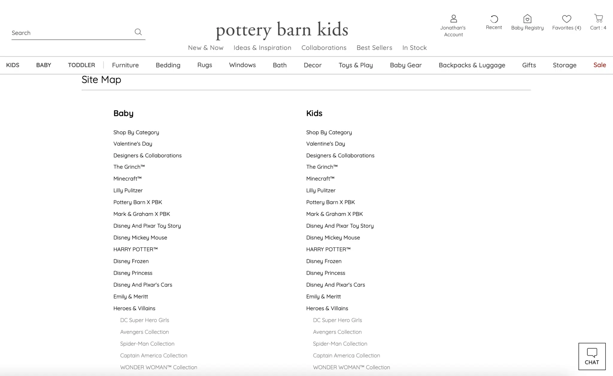
Creating a well-structured HTML sitemap and linking to it from the footer, as Pottery Barn Kids has done, ensures that most site pages are only a few clicks away, which aids in both user accessibility and SEO.
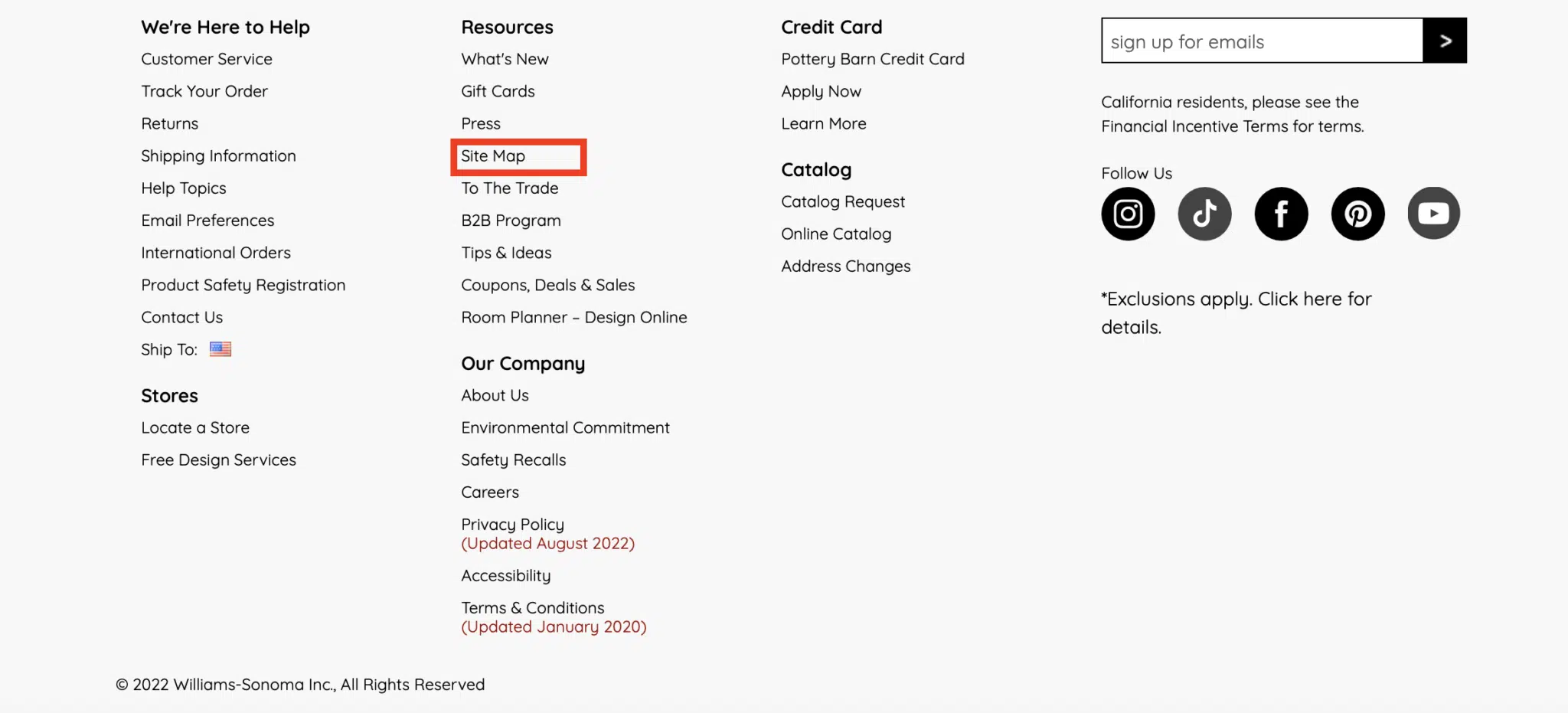
Since search engines crawl sites in a sequential manner and follow contextual cues, it is beneficial to have a single page that links to the site’s primary and secondary pages.
This can be helpful for users looking for specific pages on your website and help search engines discover and crawl all of the pages on your website.
Once created, it is essential to maintain an updated HTML sitemap on the site to ensure users and search engines can reach any page via minimal navigation.
In-content internal linking best practices
Ecommerce sites are notorious for lacking content – especially across category and sub-category pages. As a result, it could be argued some of these examples are “navigational” in nature.
However, I might argue these implementations are less ‘standard’ for navigational purposes and typically buried at the bottom of the page (where content is generally added for category pages).
5. Supporting category page content
There are many ways to build in supporting content on category pages – that could be a separate article.
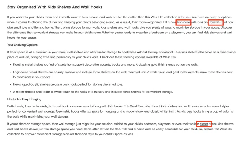
In the example below, West Elm adds a few supporting paragraphs at the bottom of their category pages with additional heading tags and content that adds value to the user experience.
Within that content, they naturally include links to other category and sub-category pages, individual product pages, and even educational/blog content where it makes sense.
6. Internal linking modules
Above the supporting page content, Pottery Barn, Mark & Graham, and West Elm utilize a row of Related Searches (read more about internal link modules here).

Pottery Barn Kids utilizes this same row directly above the footer.

In all cases, these text links take the form of long-tailed keyword-rich internal links to sub-categories and product detail pages (PDPs).
As you can see from the example above, this provides opportunities to build rich anchor text links to pages around color, texture, and even sizing – incredibly valuable for those long-tailed but highly-qualified searches.
7. Related products/browsing
Ecommerce SEO 101 requires a related products widget of some sort. This can help users discover additional products they may be interested in and is one of the foundational tactics for internal link building.
However, what was traditionally reserved for the product detail page, has expanded to category pages, and even the “types” of related products have grown exponentially.
For example, Williams Sonoma uses the standard “Related Products,” while Pottery Barn uses a “Top Picksfor You” widget on their category pages.

On product detail pages, this implementation expands to a wide variety of implementations and names, typically with multiple rows per page in a carousel allowing for a more extensive list of internal links per page:
- “People Also Viewed” (Pottery Barn Kids)
- “People Also Bought” (Pottery Barn Kids)
- “Also in This Collection” (Pottery Barn)
- “Pairs Well With” (West Elm)
- “People Also Browsed” (West Elm)
- “Customers Also Viewed” (Williams Sonoma)
- “Customers Also Bought” (Williams Sonoma)
- “Related Products” (Williams Sonoma)
- “You May Also Like” (Rejuvenation)
- And more!
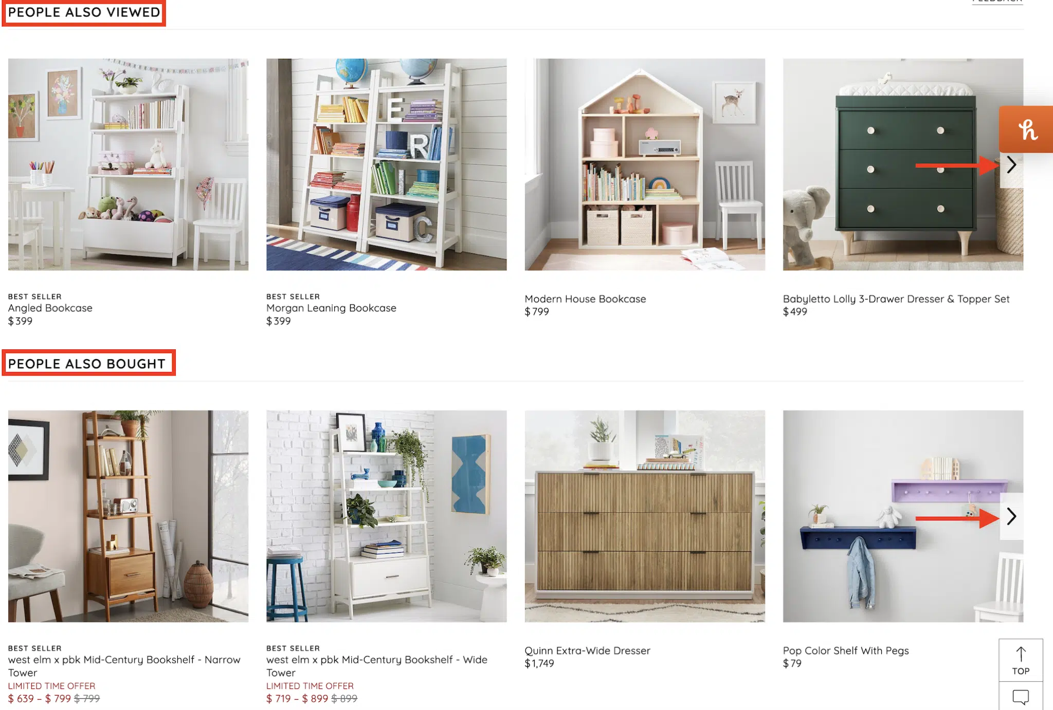
These links are invaluable for cross-selling, upselling, and flattening the overall website architecture.
8. Product attributes
Where breadcrumbs might not be possible, product attributes can fill the void.
When both can be used, they are an effective complement for each other and can reference any/all attributes a product might have:
- Size
- Style
- Color
- Brand
- Flavor
- Texture
While this type of internal link is perhaps better showcased on another site (check out REI.com), I was able to find an example of this on West Elm:

In this case, “Learn more” links to the collaboration page for Scout Regalia. I would argue that a better anchor text implementation could be done here.
There are broader opportunities across the collective sites to take advantage of interlinking among collaborations and brand pages on product detail pages themselves.
9. User-generated content (UGC)
UGC content can take on many forms:
- Reviews.
- Testimonials.
- Question and Answers.
It’s hard to find fault in Williams Sonoma’s SEO strategy. This, however, is one area where there might be a significant opportunity.
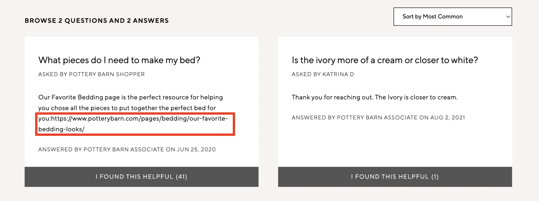
In the example above, a Pottery Barn associate left a response to a comment with a naked URL. However, the link is not clickable.
Generally, the Q&A section across the domains offers many opportunities for internal linking automation.
What are general internal linking best practices?
Now that you have a roundup of the why and where to incorporate internal links, you might wonder “what to do” and “how to do it.”
A myriad of articles outlines these internal linking best practices very well, including Moz, Semrush, and, of course, Google.
I suggest you dive into the links above for a more detailed breakdown. In my opinion, the five most crucial internal linking best practices to follow, in no particular order, are below:
- Link to deep pages.
- Use descriptive anchor text.
- Link to relevant/related pages.
- Link to the canonical version of the URL.
- Don’t use the same anchor text for multiple pages.
How do I implement internal linking on my ecommerce site?
Much of this may require some grunt work and a partnership with your development team to implement these strategies effectively.
The implementation with the most bang for your buck (and potentially the highest level of effort) is internal linking modules. I linked it above, but I highly recommend reading this article from Holly Miller Anderson for more details.
Alternatively, auditing your existing internal links to determine which pages could benefit from increased internal linking is always a great place to start.
Paul Shapiro defines this process as determining “internal PageRank,” which is an intelligent way of thinking about it.
No matter how you define it, the outcome of this exercise will no doubt provide valuable insights to get started.
Maximizing internal linking for ecommerce
Internal linking is an essential aspect of any ecommerce website.
By following the best practices discussed in this article, you can ensure that your website is easy to navigate for users and is optimized for search engines.


