3 Fixes For Improving Your Website’s User Experience
July 10, 2017

Table of Contents
The attention span of an average internet user is 8 seconds, shorter than that of a goldfish. You know what this means? More work for you! It’s time to focus on what’s important for your site and forget about those fancy tweaks on BuzzFeed.
If your visitors feel good when they’re on your page, it’s easy to know. You’d be getting more comments, shares and faster growth.
Are your email unsubscribe numbers on the rise? Lots of negative comments? Reduced engagement on social media?
It’s clear you’re doing something wrong. You’re beginning to annoy those loving followers.
But you can fix it. Wanna know how?
Here they are, the 3 fixes for improving your site’s user experience.
1. Speed Up Your Website
The average site load time is 2 seconds, but you should do better than that. It’s so easy to see why. Apart from serving your visitors with content at a rate faster than that of your competitors, it’s something Google considers a ranking factor.
But if you don’t know it’s broken, it’s difficult fixing, right?
Here’s how to check your site load time
Go to gtmetrix.com, and enter your site details for a complete analysis

And here’s what the report looks like

If you have a bad grade, meaning a slow site, here’s what you can do.
> Enable Browser Caching
Anytime a visitor lands on your site, their browser sends a request to your server, so they’d have to download the HTML document, CSS stylesheets and images before it’s live on their browser.
The time in which all this is done is what’s called the page load time.
If browser caching is enabled, visitors won’t have to “re-download” that page when next they come visiting.
You can enable caching in WordPress by using plugins like WP Super Cache and W3 Total Cache.
> Optimize Your Images
It’s important to include images in your content. It makes your post digestible. But if all your pictures are 5MB+, your visitors may not even get to see the post before leaving in disgust over your awful site load time.
Here are some ways to optimize your images:
# Good Ol’ Photoshop
Open your image files in Photoshop and go to File>Save>Save For Web
And don’t forget to reduce the image to 65-80%

# Online Tools
A simple Google search for “online image optimizer” and you’d get the results you need.

# WordPress Plugins
I’m not a big fan of having a WordPress plugin for everything but some of these plugins do get your pics ready for the web.
2. Make Your Content Readable
Whether you’re running an e-commerce site or a “how-to” niche blog, you need something that draws visitors from around the word. You need stellar, jaw-dropping content.
It doesn’t matter whether you believe content is king or not, your posts and pages must have very clear directions.
Here’s how to get it done:
> Add a Table of Contents
If you’ve been using the internet for some time, I guess you’ve stumbled on Wikipedia. You’d normally see something like this at the top of any entry
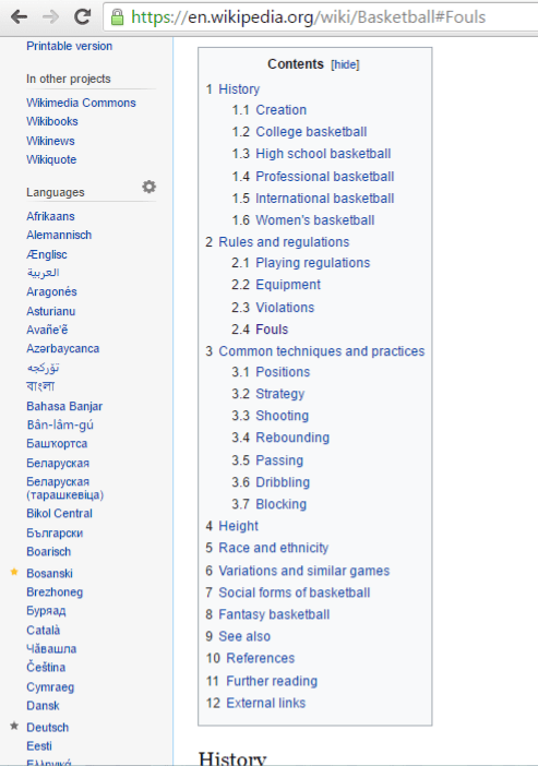
That’s a table of contents. And a clickable one at that. It gives your audience a bird’s eye view of what your post is about.
Long form contents are all the rage in the blogosphere. A visitor may need to jump right into an important section and these tables do the job.
You should check out this guide to see how it’s done.
> Use Images
It’s hard to describe how an app or a tool works without providing screenshots to support your point. You can even get your reader confused if you don’t. And that’s not a great impression.
If you want more search engine love, you need Alt Tags in your images that improve traffic to your site.
And almost nobody shares a “no-image” post on social media. It’s just not lively.
You can get free images on Flickr (read up the licenses first) and the other sites also.
Or you can create yours with Canva.
Just get something that doesn’t make your posts feel like a giant block of text.
> And Don’t Ignore Videos
A picture’s worth a thousand words, right? A video should be around ten thousand. There’s just no way you’re doing a DIY review post on how your new paint sprayer saved you a lot of time without inserting a video.
You can use services like YouTube, Wistia and Vimeo to host your videos.
> Check Your Grammar
No, you don’t need to write like it’s a college essay or anything like that. You’re writing for the web so there’s nothing wrong including conversational asides in your posts.
You can use tools like Grammarly and the Hemmingway App.
Bottom line: Not knowing that “you’re” is actually short for “you are” makes you look like an amateur.
3. Infuse A Little Common Sense
There are internet marketing rules you need to throw out right now. And there are others to live by if you want to boost your user experience. You’ve got to abide by these rules.
Here are some of them:
> Forget The Long Signup Forms
To get people on your email list, the most important thing you need is their email address. Then maybe you can ask for a name. And it doesn’t need to be their full name.

Their Twitter handles, Facebook profiles and websites are really not important. You need tons of followers, don’t piss anyone off by making your Signup form look like an application.
> Add Social Sharing Buttons
![]()
Nobody spends time creating customized intros on Facebook for an “unsocial” site.
So get those buttons, it doesn’t take more than 30 minutes.
If you have an infographic, add an embed code to the page so it’s easy to share.
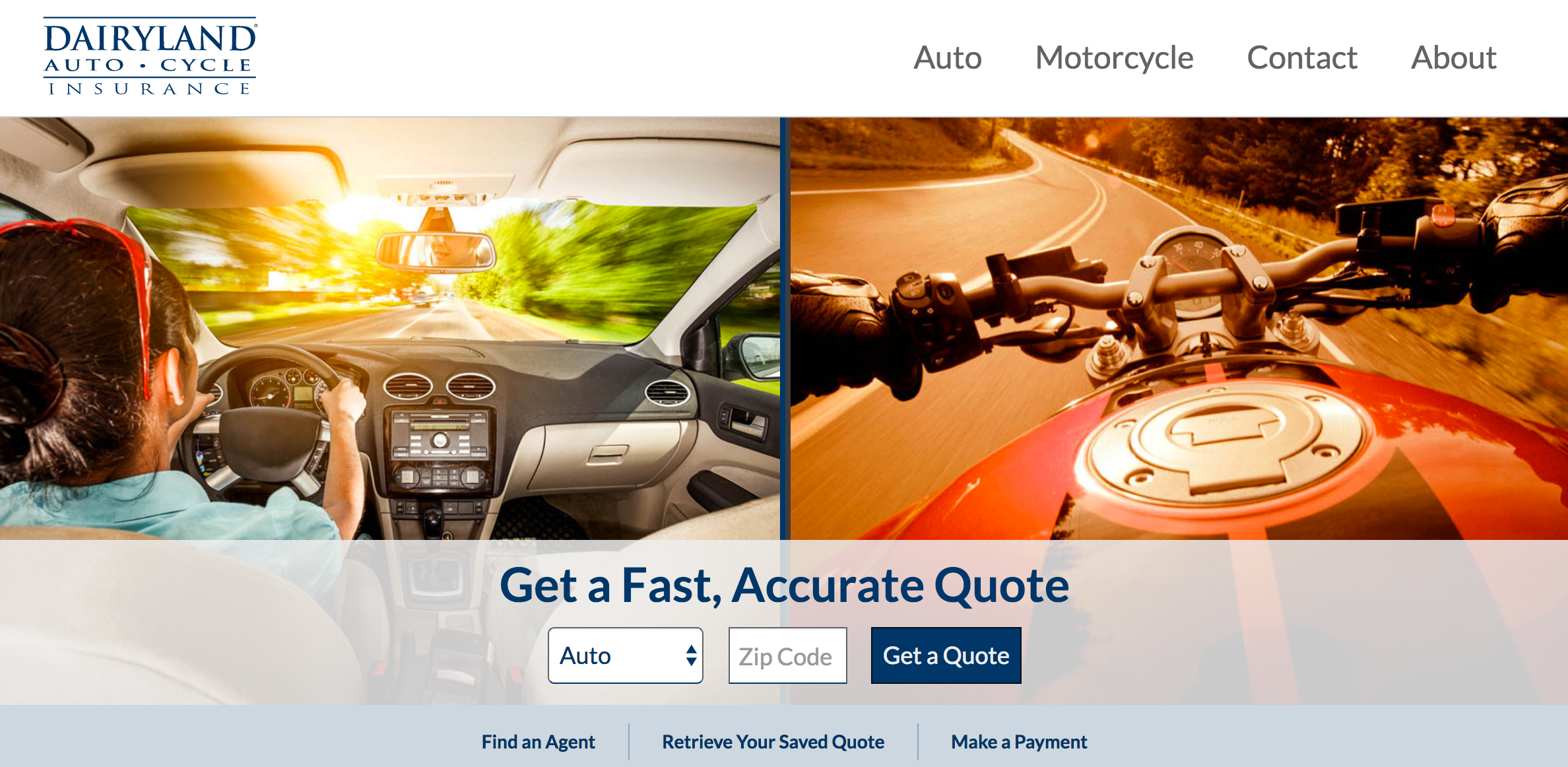
Let your site give direction. One of our clients, Dairyland Insurance, does a great job of quickly getting the consumer to the content most applicable to them via the homepage:
Going for a responsive theme makes this easier.
> Give Feedback
People are going to come to your contact page with questions. Have a feedback mechanism that shows you’d be responding to their queries shortly.
You can use an autoresponder service that does that or get a contact form that has this feature.

You just can’t ignore your visitors. They’re the reason you’re in business. And you should listen to them. Non-verbal cues like a huge drop in traffic and increasing unsubscribe rates mean you need to get to work.
Get that audience to love you again. Make them feel good on your site. These tips should give you lots of ideas.
Related posts
-

Vital Components For Successful Business Website Design
March 19, 2019
-

7 Tips For Writing Irresistible Calls To Action (CTA)
April 28, 2018
-
